Pixelart happenings and opinions
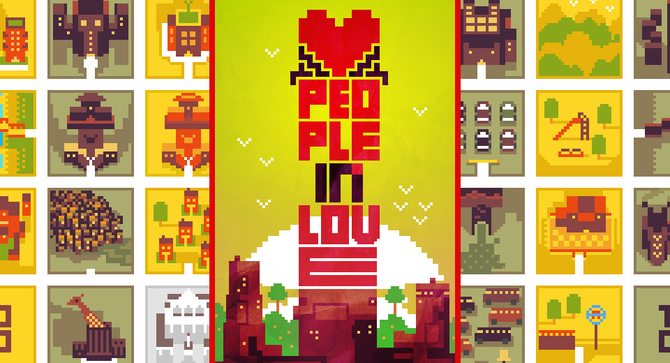
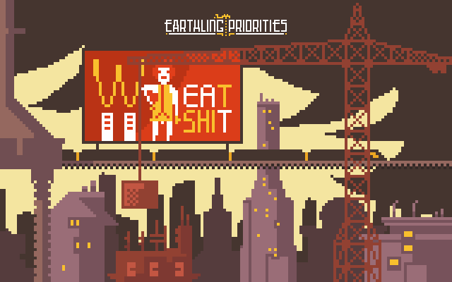
In these last months, other than working on Goscurry, fighting bureaucracy and other stuff, for once I did only the graphics for a couple games, both in pixelart (or “pixel art”, but I like the loose portmanteau version better). They are Earthling Priorities — a mini adventure game — and People In Love — a city sim where positive planning and people’s happiness are the most important factors — both still under development.
A very short opinion on pixelart
I believe that pixelart is a fantastic style. It forces you to reach an enormous synthesis, transforming each of your drawings in what might be considered a metaphor. Also, you can use your mouse while drawing, which is a great deal for me considering that I have only one tablet, and my lady uses it.
That said, I don’t like retro pixelart much. I find it reductive, as if copying some old game’s style was its only purpose. In my humble opinion, pixelart is a style, not a nostalgic artefact, and deserves to be treated that way. Which doesn’t mean that there’s no space for retro remakes: it’s just to state that there’s also so much more.
People In Love
Led by Mr Kindness Pietro Polsinelli, People In love is a tile-based game, where each tile represents a building of some kind. I have only 31×31 pixels to represent each building, in both a negative and a positive version. As with many things, drawing the evil stuff is easier, but after many tries (color-wise) I think I am now satisfied with both approaches. I tried to keep everything as abstract as possible, while also keeping it understandable and attractive. I developed an approach where I start painting with “big” 8×8 brushes to shape things up, then refine them with different colors. It’s great fun and Pietro is lovely, and I can’t wait to see it in action.
Earthling Priorities
Written and developed by Konstantinos Dimopoulos (also known as Gnome) with music by the always impressive Chris Christodoulou, Earthling Priorities is a supershort adventure about Life, the Company, and Everything (yes I like to quote book titles, kill me). Konstantinos’ directives were to use a style inspired by the old Space Quest games. So I worked on a 160×100 screen size and tried to keep the feeling of those lovely (and cruel) games, while also trying to be somewhat original. I’m still not sure how I managed, but at least I can say that I learned a lot from the experience, and there’s a big difference between the initial — now scrapped — scenes and the final ones. This one is being great fun too, and the team, once again, is just lovely.


